Media Allocation/Reach Dashboard
User Experience Design • Data Visualization • User Interface Design
The Brief
The Ad Sales department at NBCU acquired a very extensive data set from Nielsen, and had made a crude Excel dashboard to view the data in graphs. Wanting to get the most out of this data, and tired of having to make digital and linear media allocation calculations manually, they came to us with a request for a dashboard that can do it all.
The Product
A calculator/dashboard hybrid optimization tool for internal and external digital media and sales planning at NBCU.
The Client
Ad Sales Team at NBCUniversal
The Team
Amy Gingold – UI/UX Designer
VP of Research & Measurement, Ad Sales
Director, Ad Sales Research
Chief Architect, Analytics COE
The Research
Starting out, the ACoE Chief Architect and I met with members of the Ad Sales team to discuss the platforms they already made to explore this ad revenue data and the desired capabilities they lacked.
First Findings / Interviews
We had several data sources to reconcile, combining this new data set with some Ad Sales had worked with previously to have a good store of historical data to make calculations and predictions with.
When the large new data set was acquired, a member of the Ad Sales team put together this Excel dashboard, full of number walls with lots of side-to-side scrolling:

Team members had to use this dashboard, an explanatory powerpoint made by the VP of Research, or look through the large file of underlying data to find much-needed information about ad revenue.
Biggest pain points of using above modes of data lookup:
Large excel file with the entire data set took too long to use
Not all people who needed to or would need to could understand how to navigate large data document
Excel “dashboard” based on large data document was disorganized and hard to read
Dropdowns in dashboard didn’t allow for enough customization
All demographic data was shown at the same time unnecessarily
Lots of walls of numbers, none called out—hard to search through easily
Users had to make their own metric calculations in a lot of cases, lots of clicking around and recording required to determine the best publisher mix
Key Challenges
The obstacles that would haunt my dreams for several weeks:
I would have to understand all facets of this data without any previous knowledge of media allocation.
Very limited face time with members of the Ad Sales team, I would need to optimize every interaction
In attempting to figure out what the most important information to readily surface in a dashboard was, the answer always seemed to be everything. All the elements were interconnected and had to be in one view, a lot of it was nearly impossible to understand without certain other information in view simultaneously. So that was cool.
Had to determine user stories by finding out what kinds of employees/external people would be using the dashboard and researching them rather than being able to interview them directly.
Clarity on exactly what our capabilities were with the underlying data was hard to come by, it took weeks of interviews with Ad Sales personnel
Wire-Framing / Iterating
I played with many ideas for creating an editable reach build and created pros and cons lists for each I shared with teammates before arriving at the solution I’d stick with.


The Solution
I created a platform that could be used by both seasoned Ad Sales team members and external company personnel easily, with a minimal learning curve to anyone familiar with the terminology.
The “Walk”
I created a simple onboarding sequences to make sure anyone using the platform would be guided into it the same, simple way. They’d be able to opt out of ever having to see it again after their initial login, much like a native phone app.
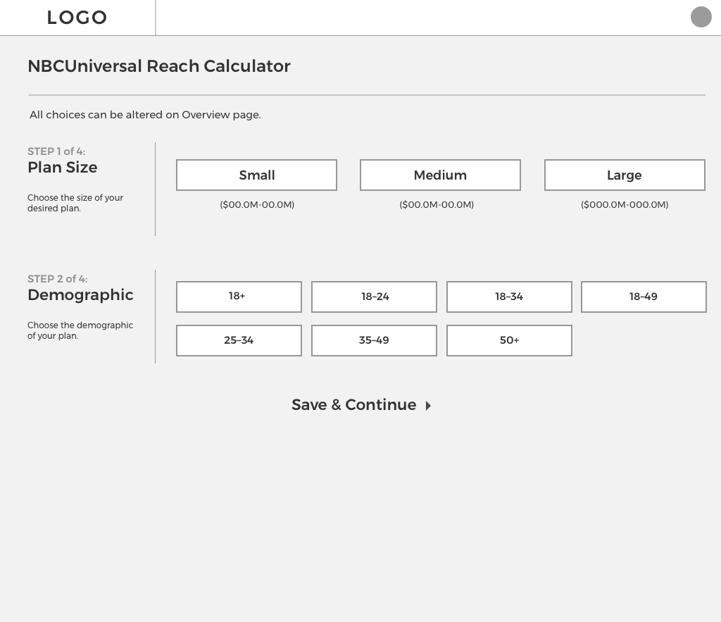

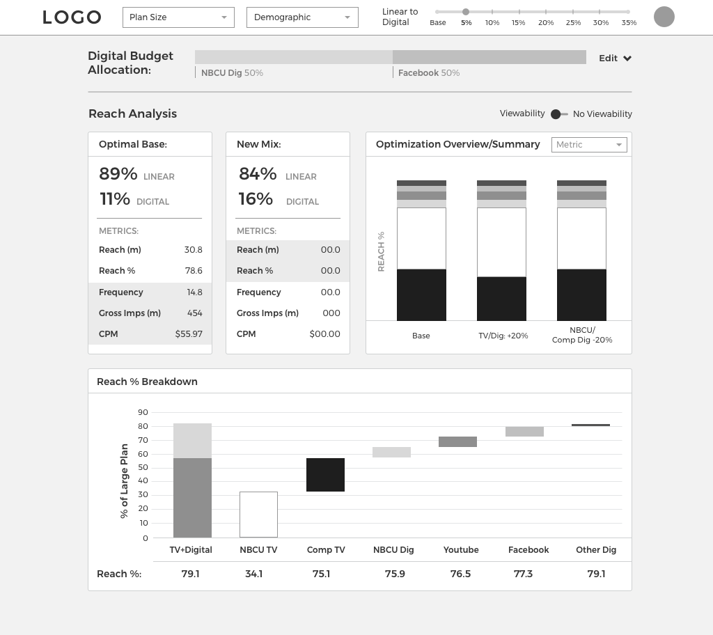
The Dashboard (Wireframe, Not Final Design)

I designed the dashboard itself to be modular and and easy to add other graphs to as we saw fit. All the choices the user made when onboarding are editable on the left side and at the top of the dashboard, but their attention is first drawn to the numbers associated with parameters the set, the dashboard having made those mix calculations for them.
Solution 1
Calculations!
We had the data to create an optimal mix of linear and digital media sales for furthest ad reach for any parameter users set, a revelation that was, rather tragically, swept under the rug until a platform like this was created.
Users would still want to ad or subtract money from different properties based on deals, relationships, or personal preferences, but “optimal” mix was brought to the forefront to make their decisions easier, and if they want to make alterations the dashboard would do the calculation work.
Solution 2
Full Customization
Customization to the extent most users and users-to-be of this data set wanted wasn’t available through other avenues.
You’d have to be a data wiz to be able to search through the data set itself to create a custom allocation build, and the Excel dashboard showed you a lot of information you didn’t need. I won’t get into the nuts and bolts of how this works and terminology, but this platform showed users a lot of information they’d want by default and allowed them to customize several parameters in just a few clicks.
Solution 3
Highlighting the Important Stuff
The most important percentages and calculations highly visible, no more number walls, no more sifting through data from several demographics when you only came to see one.
Our users were really excited about having everything they wanted to see in one place. Not too much, not too little—just enough to understand what they’re looking at and be able to make changes as they saw fit.
The Results
My contacts on the Ad Sales team were AMAZED. Amazed.
After they’d been told this project was tabled by my department leadership for months and signals got crossed (long story, ask about it!), they were so surprised and excited to receive this platform plan and layout. It had a full explanation of features I’d created and apparently had everything they wanted from it, and then some, in a simple format. They couldn’t wait to use it.