Derby Jackpot Mobile Redesign
Mobile Design • User Interface • User Experience
Overview
I redesigned several screens of Derby.com’s mobile experience, following a similar desktop site overhaul, to increase user retention from ad campaigns and engagement of current users with the mobile site.
The Problem
Derby.com's mobile site has a lot to offer—it's a portal to mobile versions of all our desktop users' favorite games, and a great way to onboard new users looking for a way to bet on the go. However, the first page most users saw on the site, the mobile version of Derby Jackpot, often left them confused about how to interact with it and whether they could trust our company with their info and money.
We had to figure out a way to unify our desktop and mobile sites a bit better for the users coming from desktop, and onboard new users with a visually pleasing and more usable mobile experience.
Original Screens
Homepage (far left), bet types page, and Win bet page.
Issues With the Original Design
Having redesigned a large portion of our desktop site already and seen a massive spike in new user retention, it became clear we were onboarding only a tiny fraction of the users on our mobile site we had the potential to.
Our customer service team got several calls a day from people who just wanted to know if we’re a real organization.
The Main Issues:
Unclear, confusing calls to action and CTA button colors on homepage, resulting in drop-off of potential new users
Too much dependence on the Back button to move between important pages, such as bet types
Tiny, hard-to-read text in some areas
Important navigation hidden in hamburger menu
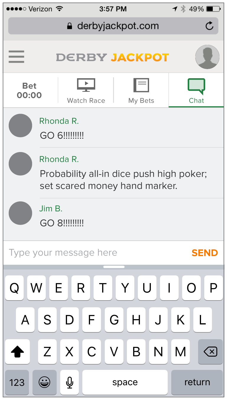
Lack of user chat, which is an extremely popular part of the desktop product
Too much dependence on users scrolling down homepage to find important info
Not a clean, modern design—purely functional
My Redesign
We had a really tight timeline on this project—a little over a week—knowing getting something new out to our users over the winter holidays would benefit both them and our company as long as we collected a lot of feedback to continue iterating.
New Navigation
To begin, I had to create a new navigation system that took important in-game navigation out of the site's hamburger menu. Users would still have to use that menu to switch to different games, but sub-navigation would be moved into the game itself.
I determined from months of discussion with users in the desktop site's chat, email feedback collected from costumer service, and watching users interact with the site that the most important items to include it were the main homepage button (with a countdown to the next race), a page for watching the current race, a page to view your most recent bets and their outcomes with a tap, and a chat screen that were easily accessible.
Home Screen
With the new nav bar providing necessary context for where you are in the game site, and the bet types you can choose from above the fold and easy to switch between, it was no longer unclear how to interact with the homepage of the game.
The Changes:
Tab navigation between different pages of the app
More obvious calls to action
Addition of player chat screen
Only most important info about current race called out
Swipe navigation between bet types for easily placing multiple bets
Individual horse race history expanded/made readable instead of displaying tiny text
Bet type instructions explained when user taps to them
Simple indication of whether you've starred or previously won money on a horse
Betting flow more unified with desktop version


