NBCU: FAST
User Experience Design • Interface Design • Data Visualization
The Brief
The FP&A team at NBCU had to look through several data sources for a comprehensive view of the money NBCU makes from ad sales across all its properties on a regular basis, creating major issues with efficiency and frequent misunderstandings.
Our job was to create an unprecedented web-based dashboard to view the most commonly searched-for information in a clear and navigable way, with obvious hierarchy and drill-down capabilities the data sources were missing.
The Product
A web-based dashboard to help NBCU’s FP&A team view important financial information quickly and efficiently. It became FAST for Finance Ad Sales Tracker.
The Client
The sales FP&A team at NBCUniversal
The Team
Amy Gingold - UI/UX Designer
Chief Architect, Analytics COE
Director, Analytics COE
Senior Director, Finance Innovation at NBCU
2 External Auditor Consultants
My supervisor, a team front-end dev, and a UX Designer from a consultancy in initial meetings
5 developers
The Research
Starting out, we talked to two FP&A team leaders to discuss the current modes of acquiring recent ad sales numbers, how they’re put together, and pain points in the process of looking for the numbers they need for research, reports, and presentations.
First Findings
There were 3 different documents they had to search through on a regular basis, and therefore 3 hierarchies that needed to be reconciled:
Pacing vs. Budget Summary File: Most commonly used by this team, also nightmare fuel
PAM: Portfolio Asset Management Dashboard
Controllership Dashboard: Financial external reporting hierarchy

Pacing vs. Budget Summary File
Look at this excel monstrosity.

PAM
Drills down into info contained in PvB, like drivers behind R/P/V data, but has more than is necessary for our dashboard.

Finance/Controllership Dashboard
Not often referred to, mostly used by higher-level employees for quick check-ins. I designed the navigation.
Interviews
In a few interviews and usability tests I could get with members of the Sales FP&A team, as well as group meetings, I was able to assess pain points of searching through these three documents and what would be most important to include in a new one.
Biggest pain points of current research documents:
KPI and metrics charts: most important and most searched-for info not highlighted in any way or being communicated efficiently, people have to dig for relevant numbers
No simple or visual way to see historical data or trending forecasts
No drill-down capabilities—PAM has some, but a lot of unnecessary info for people who’d be using this dashboard
No holistic view of each property network
No simple way to view for users to view how historical forecasts match up to current actuals
Steep learning curve to navigating PvB document that a lot of people had to use
Potential user requirements:
Subject to change over time.
Organizational and metrics hierarchies that can be drilled down into
Make it as visual as possible
Simple table views available through segment menus
Historical data should look back as many quarters as possible
Financial AND sales view
Ability to quickly digest a trended view
See the totals on this dashboard vs totals in ledger (excel document) and quickly see discrepancies
Key Challenges
With the foundation laid for beginning this project, these became apparent:
Our users were used to looking at everything in tables, but visualizations would be more effective—we’d need to ease them into viewing info in a new way.
We’d likely not be able to determine exactly how data will look, mainly how long the most high-level numbers would be. We had to begin work before all that was figured out on the data side and plan for the numbers we expected.
We would have very little face time with end users throughout the project, we’d have to really optimize the time we had.
A dashboard like this, to our knowledge, didn’t exist yet—we’d be creating it from scratch with nothing similar to reference.
Navigation. With 3 different hierarchies to reconcile into one product, creating a clean and uncomplicated navigation with obvious hierarchy that feels familiar enough to users will be tough.
Top Goals & Insights
Efficiency.
Surface the most relevant numbers to our users without them having to dig.
Easy Onboarding.
Allow users to see information the ways they’re used to alongside our visualizations.
Comparisons.
Allow users to see comparisons between time periods and calculate differences with minimal effort.
Holistic Property Views.
Users should be able to surface an entire property view at once.
Drill-Down Capabilities.
Users should be able to find out more about the numbers they’re viewing by simply hovering or clicking into them.
Getting Started
The beginning stages involved white boarding and meetings with any FP&A people I could get ahold of to see what they’d want to see in a platform like this.
First Brainstorms/
Sketches/
Mockups
The director of Finance Innovation shared some initial ideas with us in a “whiteboarding” session:


The consulting UX designer also created a mockup based on our discussions:

Key Takeaways
Deliberating on and testing these ideas against use cases yielded some important things to remember for future iterations.
We should stay away from pie charts, and drilling down from them would be confusing
The Kayla R/P/V chart doesn’t necessarily have to be a table, and we used a version of it in the final product
“Build” style navigation in the consultant’s mockup would be problematic for many reasons
Wires:
Round 1
I began the process of creating mockups based on our initial team and user feedback, leaving a lot up to discussion.
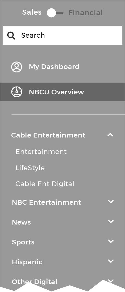
Navigation
With three hierarchies to combine and many potential users we talked to looking for very different things from it, creating the navigation proved extremely complicated.


Page Body
I started with a simple, modular design for the page body and a few features that seemed important to include as a jumping off point for team discussion.


Main Takeaways
Testing these initial mockups with the group yielded some important findings.
The navigation was incredibly difficult to figure out, but my idea to base the left hand nav off the PvB ledger was solid enough to start building the rest of the navigation around. It was the simplest way to keep property-finding familiar and easy for users.
The left side navigation (left) with the least scrolling required would be best
The top/timeline navigation as a scenario vs. scenario setup would have terribly cumbersome dropdowns and the back-end data might not be able to support it
The Ratings/Price/Volume Breakdown section is one of the most important to have in this dashboard, and it got the best response as a waterfall/walk chart with simplified drill-down capabilities versus the tables in PAM they usually had to check.
Historical data had to be glanceable, but in this format one couldn’t see how each quarter compared to the same one the previous years.
Wires: Rounds
2 & 3
Based on feedback from the FP&A team on our first iterations, we were able to come up with a top navigation that wouldn’t have a learning curve for most team members and a tertiary navigation that pulled it all together. The details in the page body also began coming together.
Navigation


Page Body


Main Takeaways
The timeline chooser segment of the navigation finally began coming together when the parameters of what we were capable of surfacing with the data became more clear. I realized there was another product I’d redesigned the navigation for—the Controllership Dashboard, one of the data sources this was based on—that we could probably copy the navigation from and achieve exactly what we wanted in a simple way.
With the the user now having the ability to choose their BU/Property and time scenario/periodic actuals, the last piece of the puzzle would be allowing them to compare those actuals to the budget they set, the prior year’s actuals, or the estimates they made—thus, a simple tertiary navigation was added under the timeline that had a very apparent connection to the page body.
Surfacing large numbers that show the two highest level summary numbers of the comparison parameters the user set in the top left corner was a big hit.
Comparing historical numbers to those from previous quarters right on the graph was possible to do cleanly, but the historical summary to the right might be a little too ambitious with our current resources.
Each of the main graphs would be “flippable” or open a pop-up to surface the same numbers in table form.
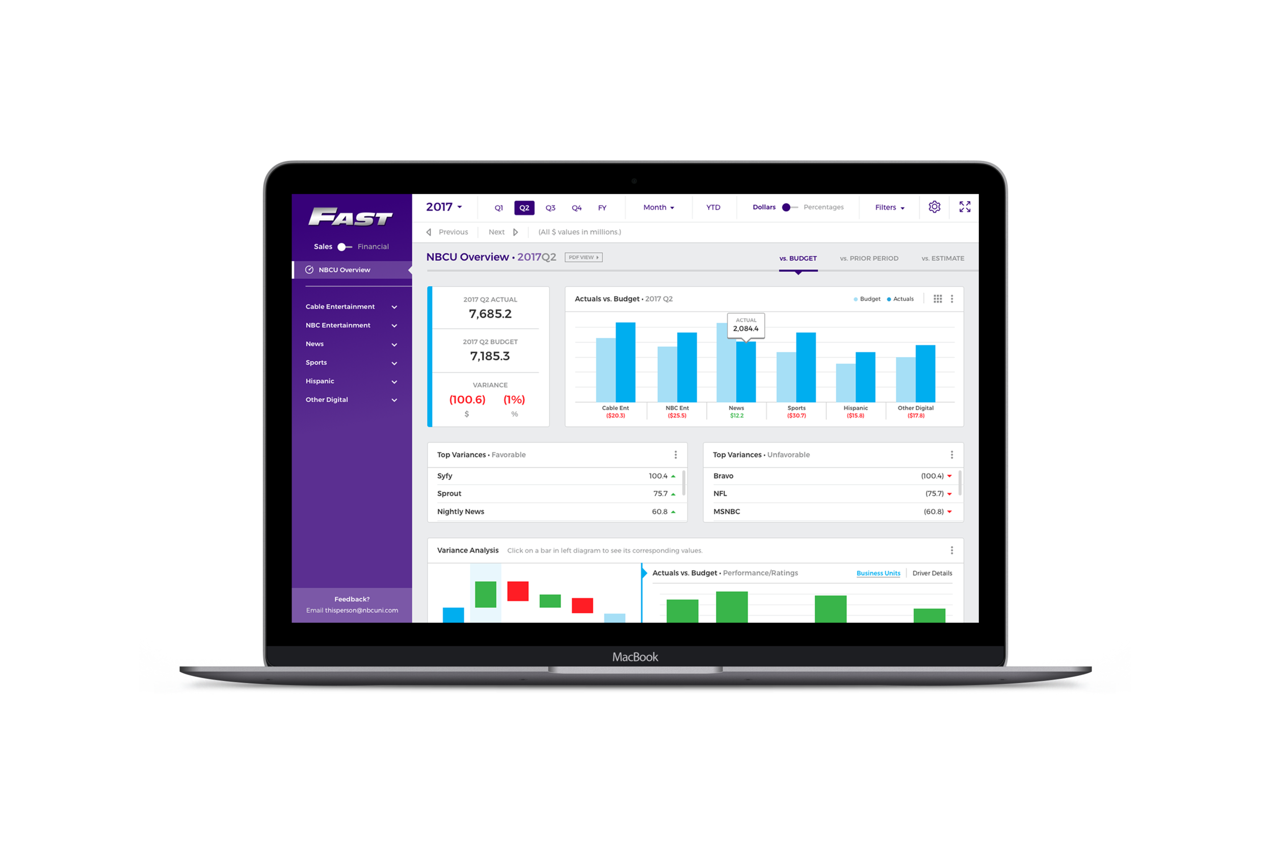
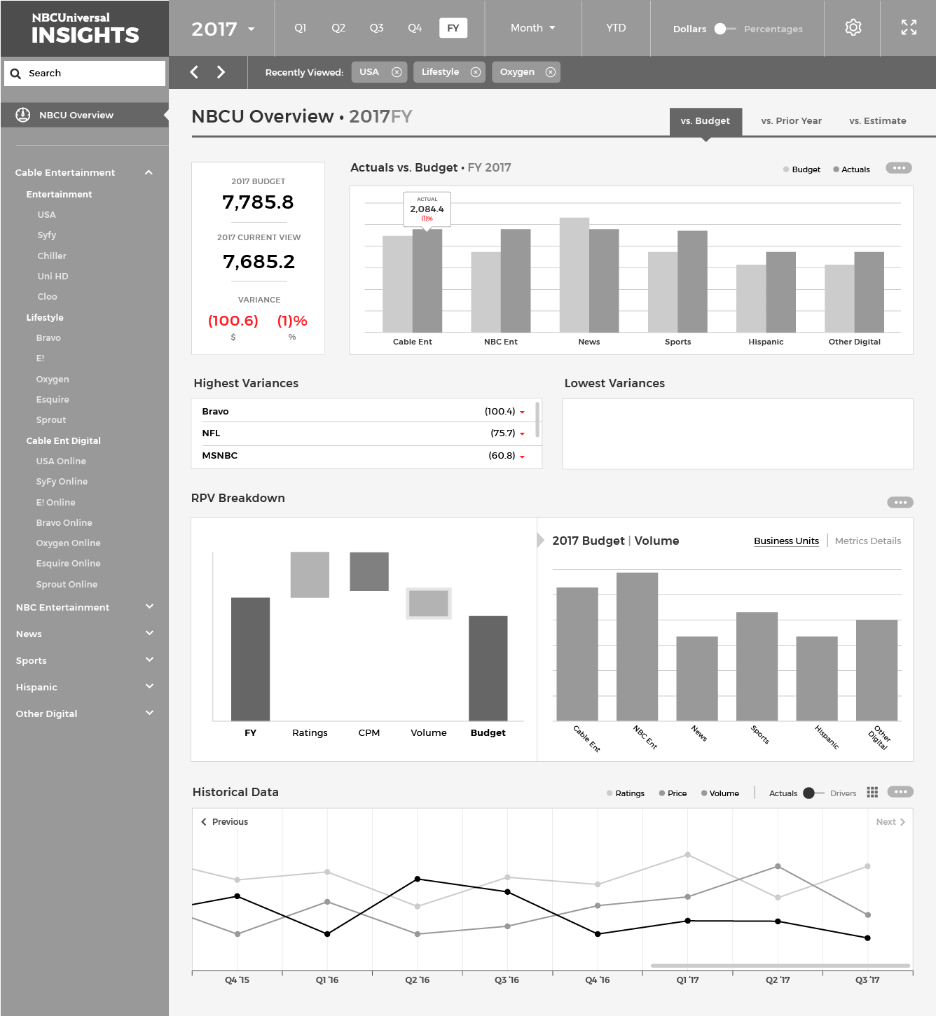
The Solution
Simple Navigation:
Recognizable terminology and placement of navigation tools for any user’s purposes, based on platforms they’d already used.
Obvious Hierarchy:
No more important numbers hidden—properties and numbers the users are looking for are immediately findable without endless scrolling and eye squinting.
Seamless Combination of Data Sources:
Users no longer have to search multiple platforms for the “what” and the “why” behind the numbers they’re seeing, R/P/V data on any BU or property is right in front of them when they need it.
Historical Trending:
No more clicking through multiple dashboard and tabs to find out how our numbers have changed from one year or quarter to the next. Making estimations and creating budgets are way simpler.
Final-ish Screens
Final screens I designed from scratch for the FAST platform in Sketch, subject to change with feedback—all data shown was made up for illustrative purposes only:
Main NBCU Overview:

They MADE ME base the logo on the Fast and Furious logo, I swear.
Business Unit Overview:

Single Property Overview:

Table View of Graphs:
Actuals vs. Budget, Prior Period, or Estimate:

Variance Analysis:


To avoid users having to scroll sideways to see important totals, we made those the first column.
Historical Actuals:

Downloadable PDF View of NBCU Overview (for presentations):

The Results
The product and its functionality were demonstrated to the CEO of NBCUniversal, Steve Burke, and approved for continuation and allotment of further resources.
Response to the product from the FP&A team has been overwhelmingly positive, it has a majority of the functionality they wanted (with more in the works) for their purposes of checking financial updates, creating estimates and budgets, presenting, writing investor relations call scripts, etc. Digging through Excel for important numbers and constantly doing manual calculations are a thing of the past.
Future Steps
Several features, even some you see in the above designs, were saved for future phases of the product roll-out.
Property click-through:
A priority from the beginning, but difficult to engineer, the properties on the high level overview pages will be clickable to take users directly to property overviews for easy drill-down.
Ongoing feedback loop:
With new people using this platform constantly, we want to make sure every bit of feedback they have is heard and addressed. Deciding how this will happen and what feedback goes to the data side people or design side people is imperative moving forward.
Customized Experiences:
In the first stages of this project, we toyed with the idea of giving users a “My Dashboard” custom view of their top most-viewed properties (channels, accounts, etc) and their corresponding numbers. If use of FAST is expanded beyond the FP&A teams to property finance officials, a quick-view page like this could be needed.
Operation Prioritize Design:
In departments where most people are used to looking at Excel documents like PvB, design as a solution hasn’t been sufficiently explored. Empowering users with the knowledge that their work lives and research methods can be far more efficient, automated, and intelligent, and there are teams likes ours available to help, can massively benefit this old-school institution in the long run.